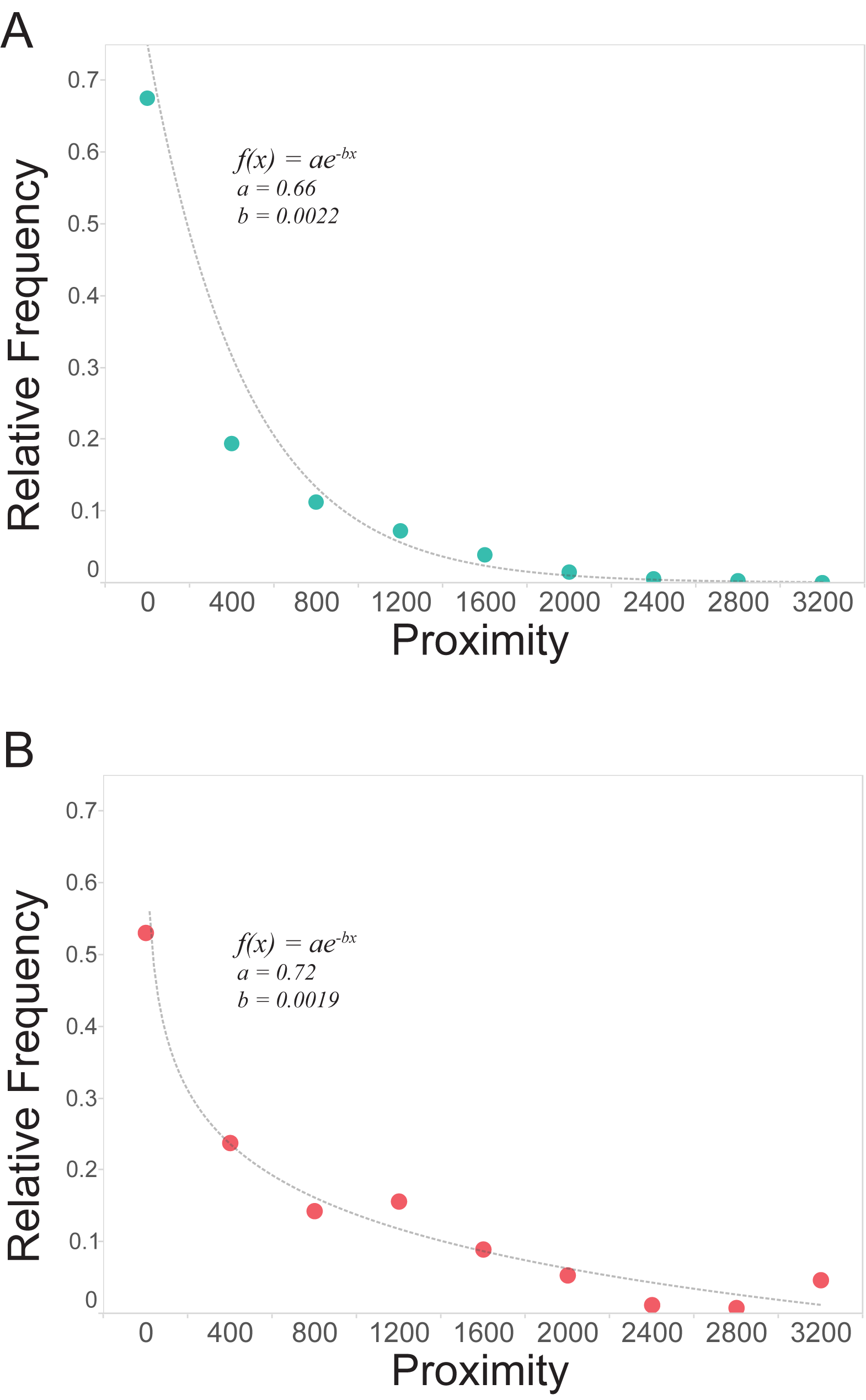
These two graphs show the power of proximity as a driver of collaboration between scientists at MIT. On the Y-axis, relative frequency of papers (upper) and patents (lower), and on the X-axis, physical distance, with a normal curve showing the likelihood of collaboration.
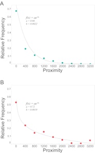
Featured Image: These two graphs show the power of proximity as a driver of collaboration between scientists at MIT. On the Y-axis, relative frequency of papers (upper) and patents (lower), and on the X-axis, physical distance, with a normal curve showing the likelihood of collaboration.
Find exclusive content in the
INNOVATION ZONE
Premium content for Global Partners, Corporate and Community Members.
The latest analysis and commentary on the future of work and workplace in five
distinct themes: Research & Insights, Case Studies, Expert Interviews, Trend Publications,
and Technology Guides.
LEARN MORE