Whiter shade of pale: why the colour of the year is slightly off
Pantone’s choice of Cloud Dancer as its colour of 2026 is fine for those who just want to chill while our world collapses. Could a different shade make a difference? A neuroscientist explains
Pantone has selected Cloud Dancer as its 2026 colour of the year.
Announcing its pick, the company says that Cloud Dancer ‘serves as a symbol of calming influence in a society rediscovering the value of quiet reflection. A billowy white imbued with serenity, Cloud Dancer encourages true relaxation and focus, allowing the mind to wander and creativity to breath… Cloud Dancer invites a space where function and feeling intertwine to build atmospheres of serenity and spaciousness, providing a refuge of visual cleanliness that inspires wellbeing and lightness.’
Lovely. But picking white as the colour of 2026 is an opportunity missed. No matter where you think the world should go in the year ahead, a version of white is not the colour that will help societies get there.
Aligned with science
Before we get too far into other options, it does seem only fair to acknowledge the content of the Pantone announcement that aligns with neuroscience research.
Since it is a light colour, putting Cloud Dancer on the walls will indeed make a space seem more spacious. Pantone also says it blends well with a set of not very saturated and light colours (i.e. Lemon Icing, Nimbus Cloud, Raindrops on Roses, Ice Melt, Peach Dust, and Almost Aqua) and that is indeed the case.
The colours mentioned are also relaxing to look at and calming viewers may be a fine objective for the year ahead. The pink option deserves special mention as seeing shades of pink has been shown, by neuroscience research, to make women feel more optimistic. The blue is a good alternative when you want to please: people worldwide are more likely to select blue as their favourite colour than any other shade.
Step up or relax?
However, 2026 is likely to be a tough year and having lots of Cloud Dancer around us might not be too useful. The way I see it, society has two, diametrically opposed options in the year ahead that colour can support. We can step up to make the world a better place. Or relax and try not to let the collapse of the best things in our world upset us.
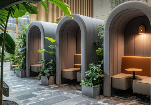
If you’re up for relaxing, the less saturated, lighter colours that Pantone profiles with the Cloud Dancer announcement are great for doctors’ waiting rooms and airports. If you feel in your heart that society should spring into action, more saturated, darker shades, such as the rich tones of sapphires and emeralds are great options, although they will make the spaces where they’re used on walls seem slightly smaller than they actually are.
You may have noted that in the last paragraph I did not mention rubies. They were not unintentionally overlooked. When people look at shades of red, even briefly, their analytical performance, according to multiple neuroscience studies, is degraded. If we’re going to act, we definitely should be doing so while effectively channelling all of the resources at our disposal.
Emeralds were very intentionally mentioned. Seeing greens, again even only for a moment in time, enhances our ability to think creatively, which is certainly something that is in order if we’re going to go the more active route—the problems we need to resolve do not have easy solutions.
Choosing Cloud Dancer is like selecting vanilla ice cream…
Cloud Dancer is a fine option in a place where you want to bring thoughts of cleanliness top-of-mind (say in a lab where medicines will be prepared) or to mix into other colours to make them lighter, but it is unlikely to support our collective goals however we define them.
Choosing Cloud Dancer is like selecting vanilla ice cream when there are other flavours available, ones that better complement the meal you have planned.


